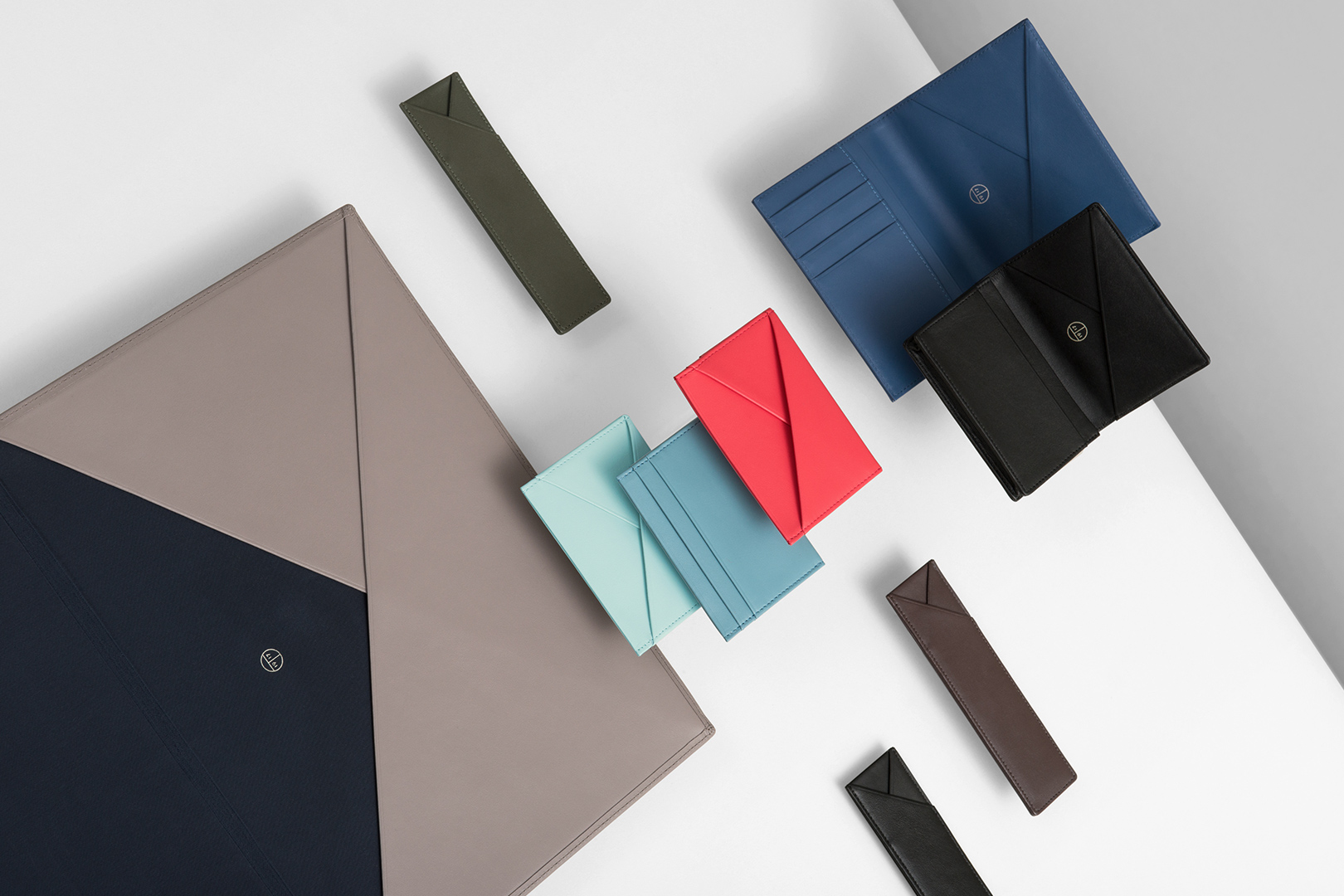
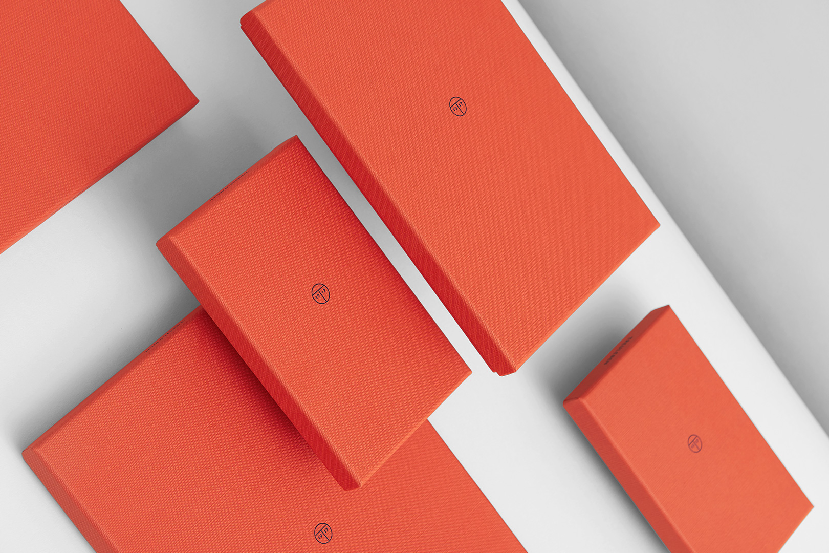
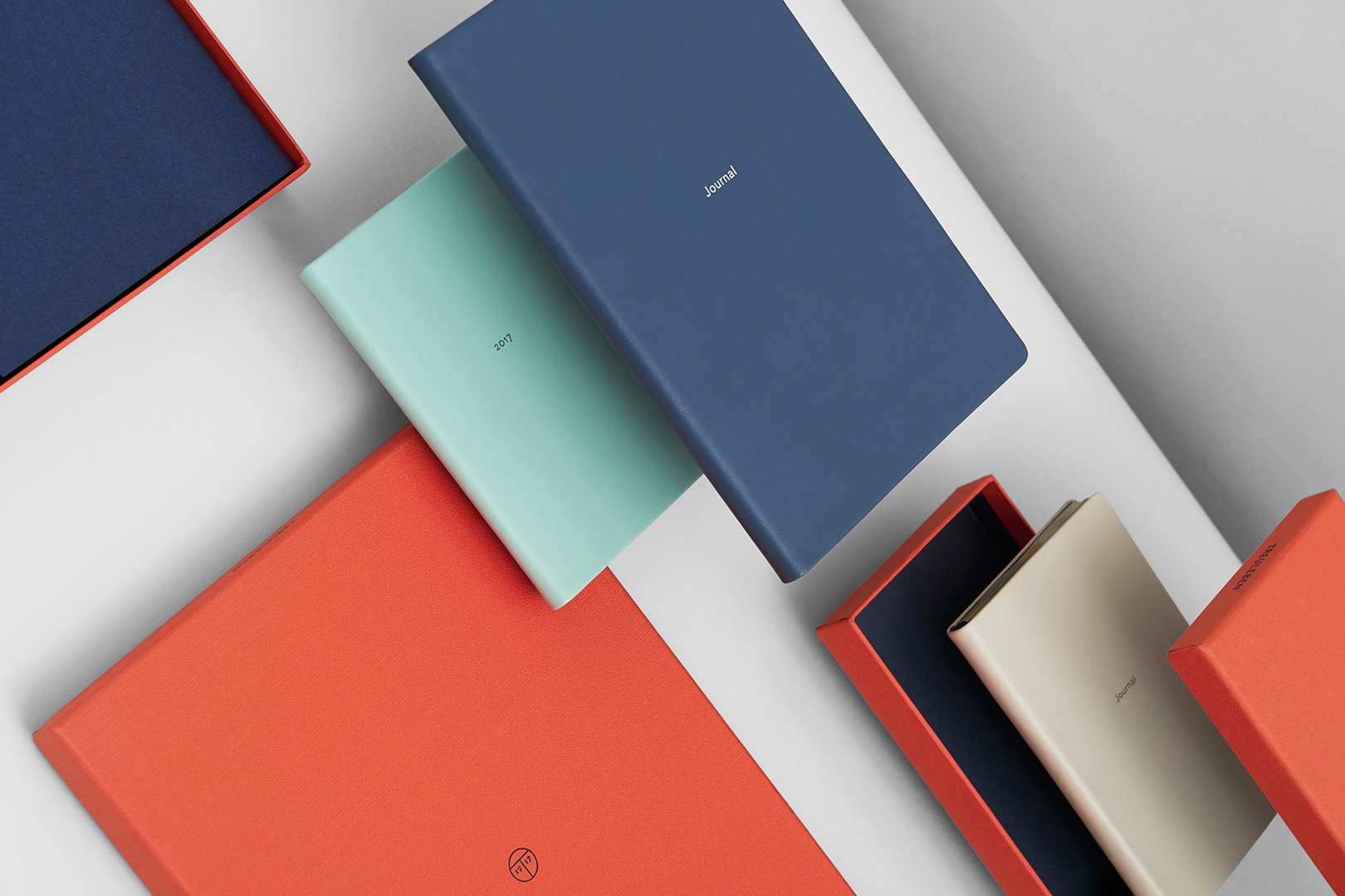
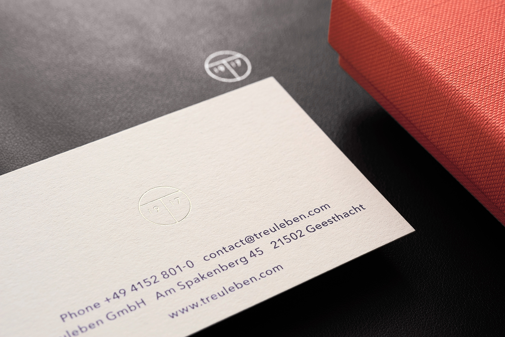
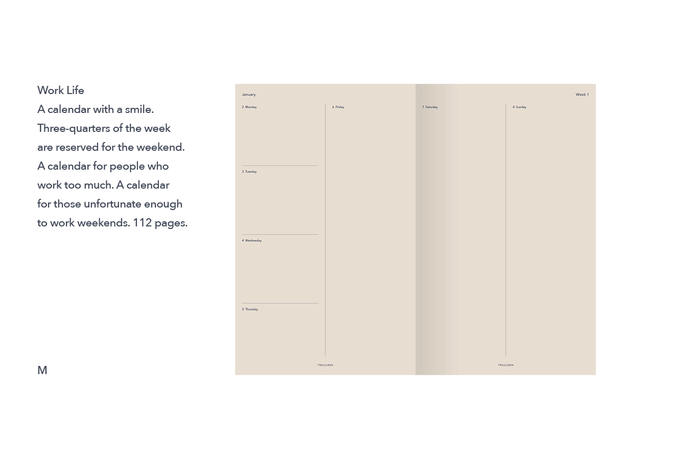
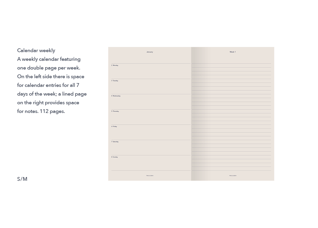
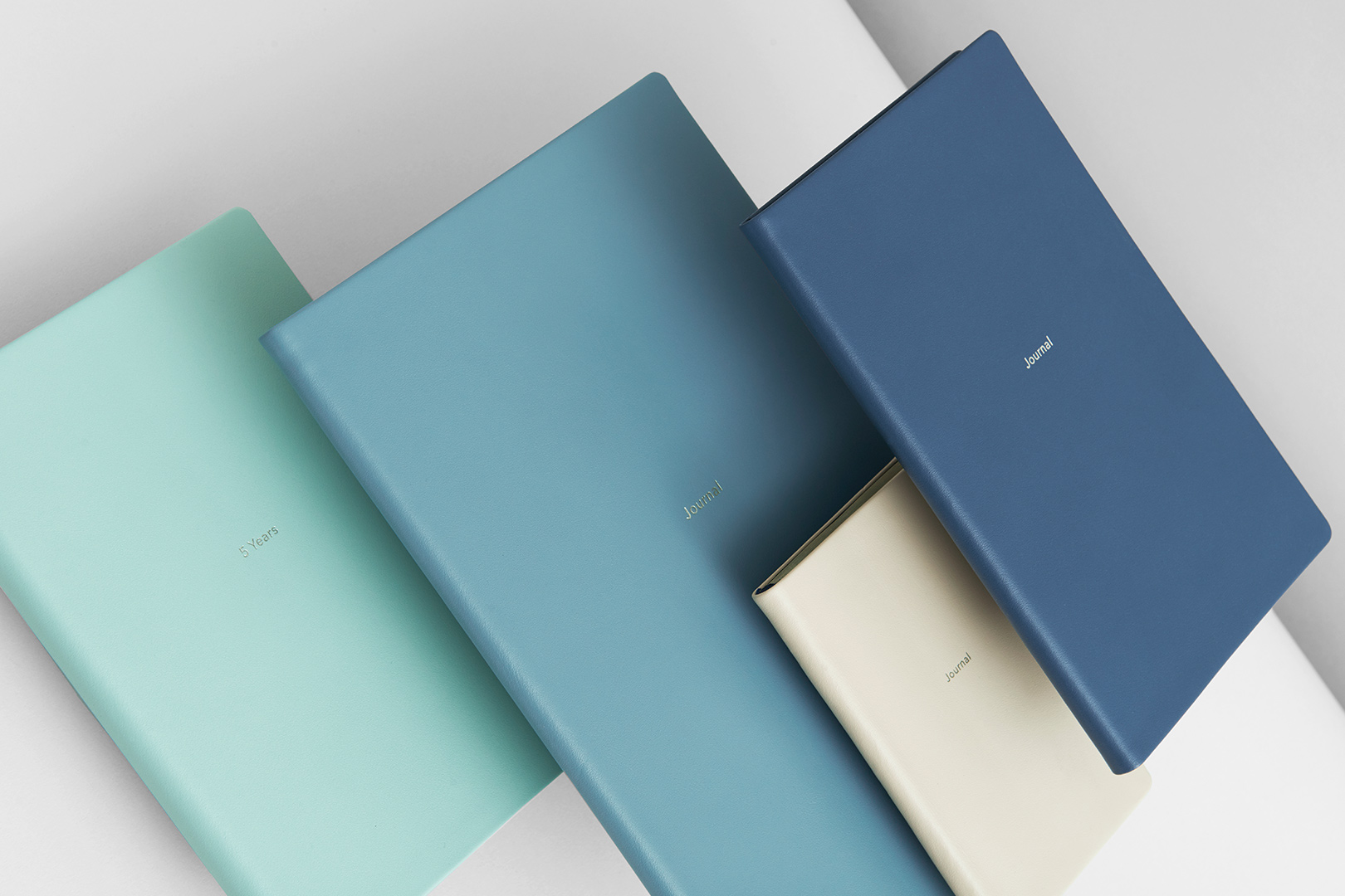
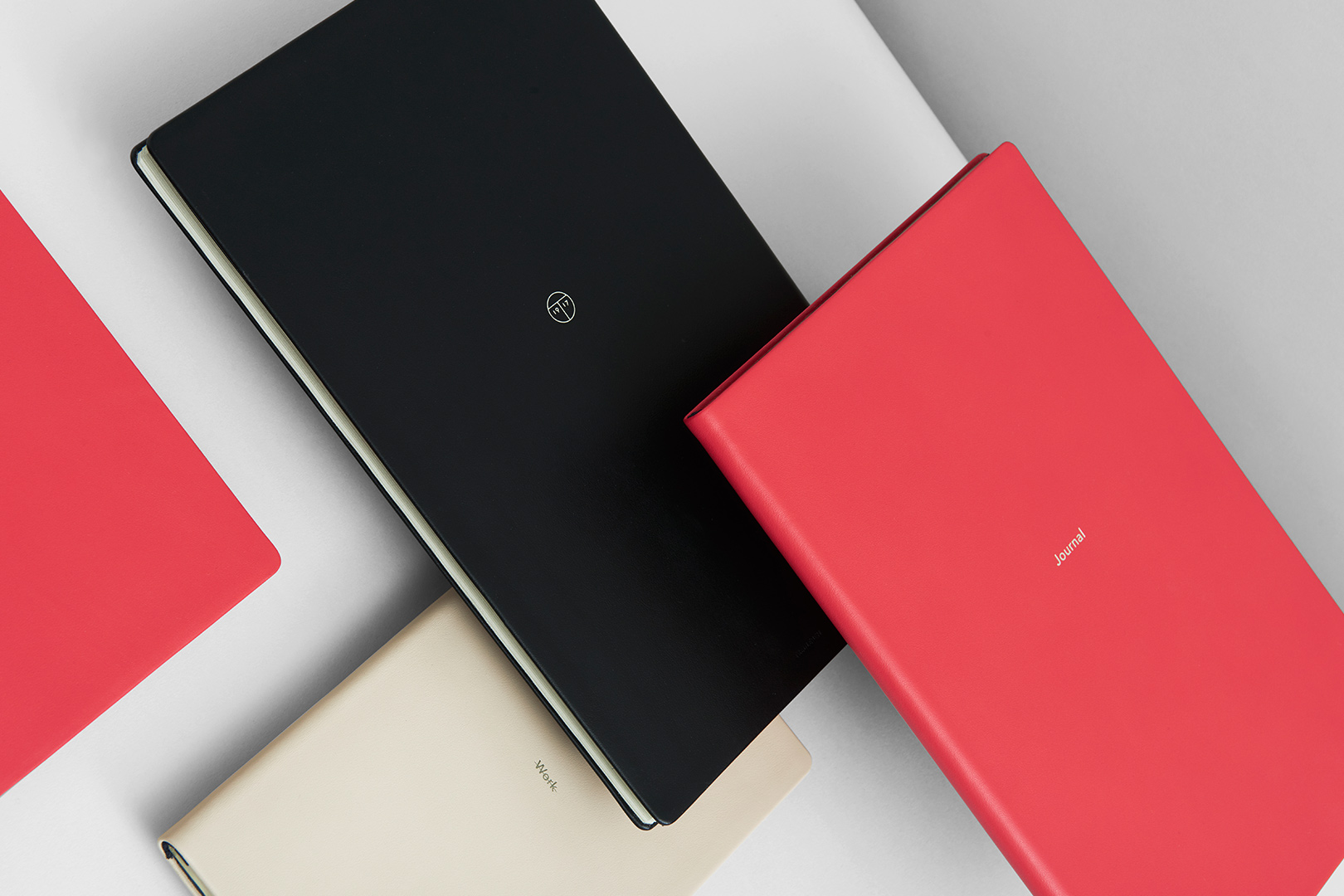
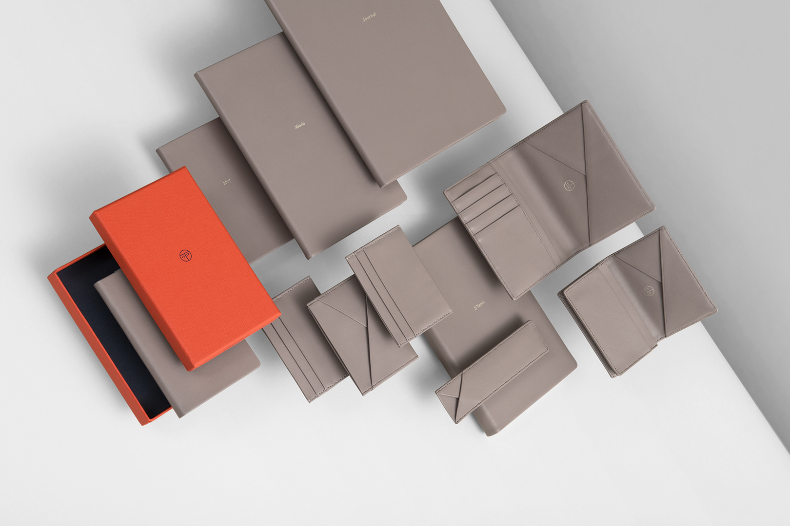
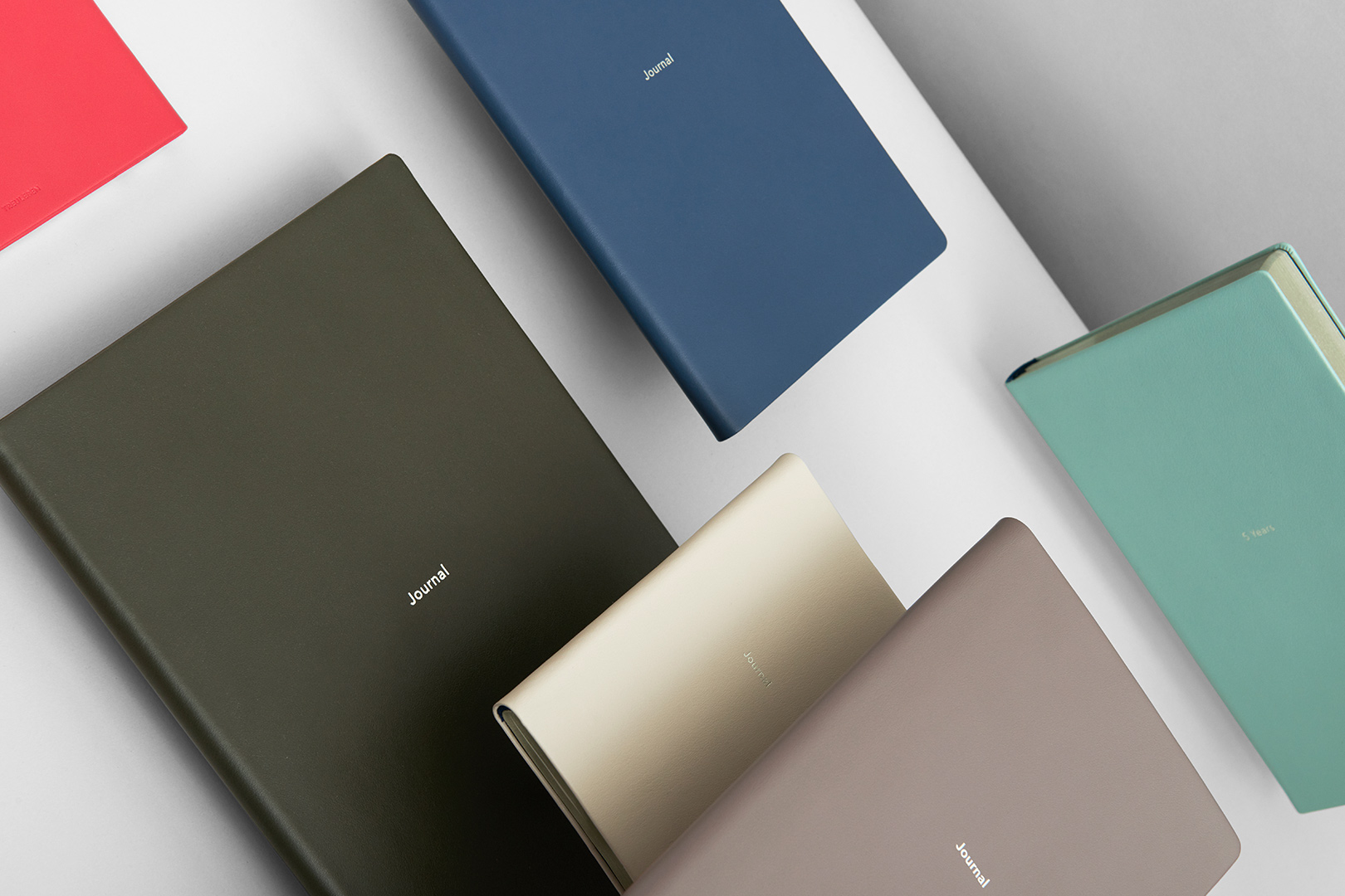
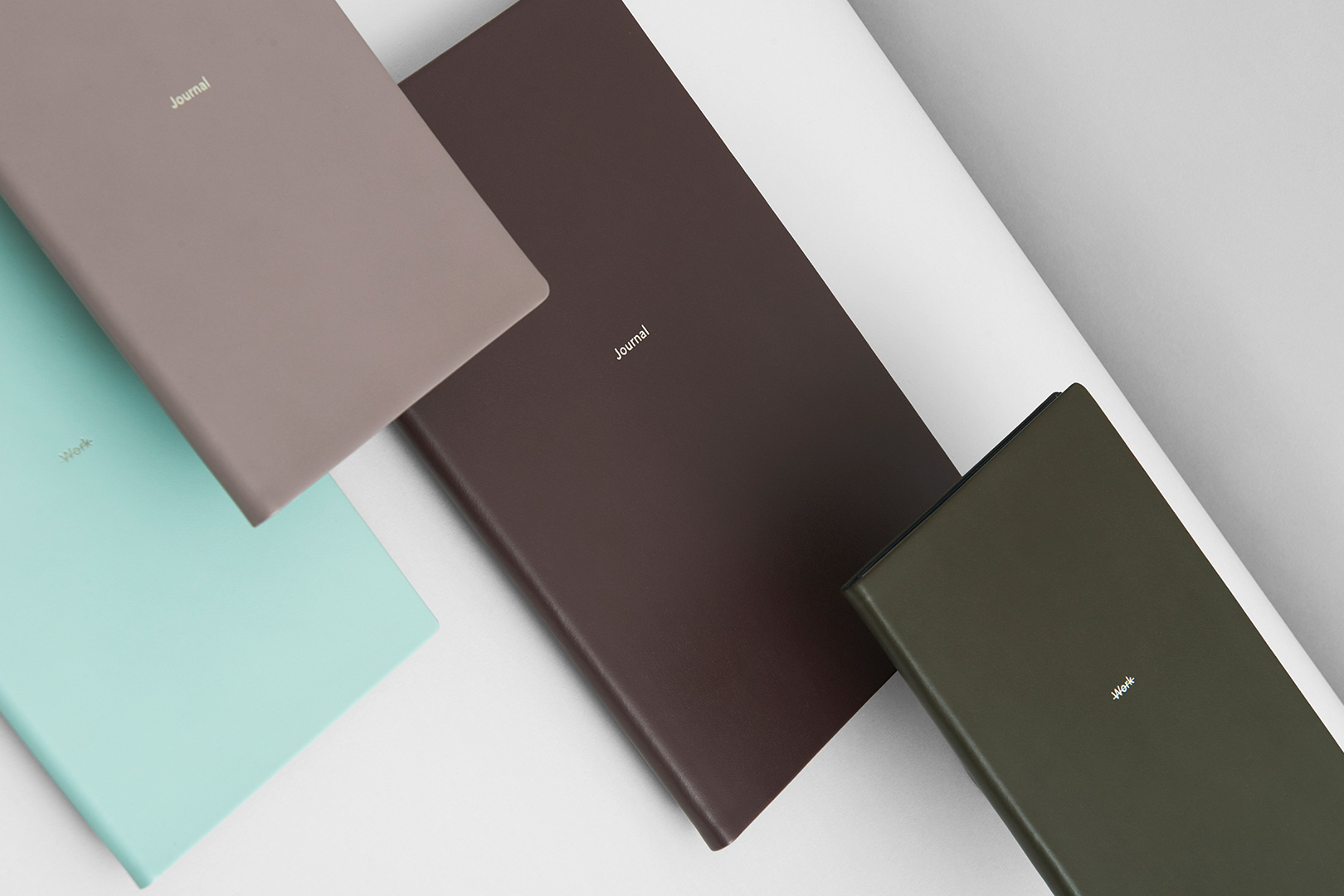
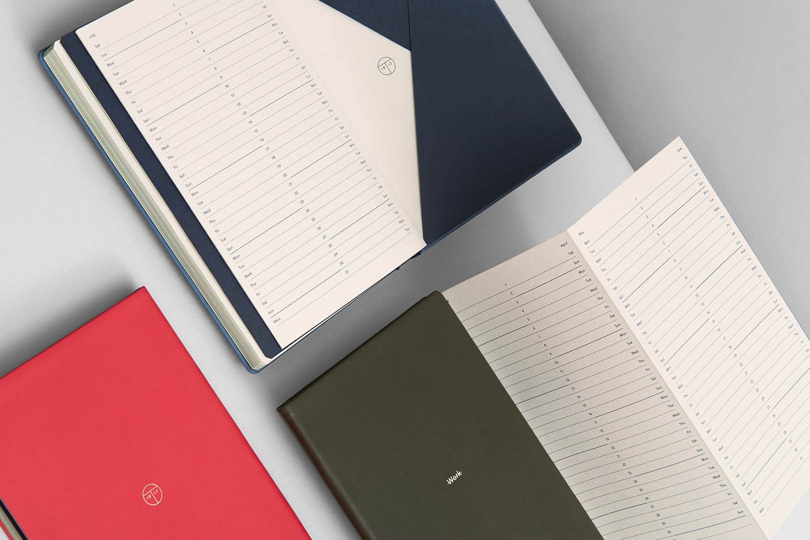
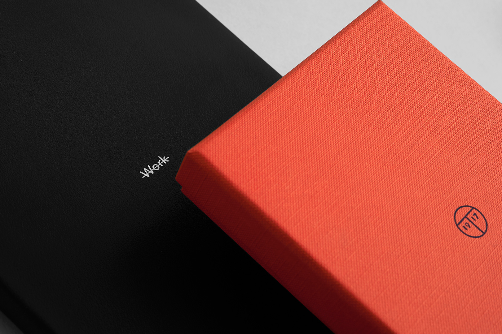
99 years of tradition, entrepreneurship and excellent craftsmanship: This is what Treuleben & Bishof, founded in 1917 and famous for its calendars, notebooks and small leather goods, stands for. Family run until 2016, a new era began on the backdrop of old values and a wonderful history. How should the new paper products be perceived, what are its core values and who are their future compagnions? A new, unique paper was created, a gilt edge in a special colour was coined and we reinvented the book pocket – these are all parts of the new calendars and notebooks, bound in finest calf leather. The brand was shortened to a concise „Treuleben“ and is complemented with a signet depicting a „T“ in addition to the date 1917, the founding year. The typography of Treuleben stems from its first retail store and was drawn by hand, embracing the 21st century. Dark blue and coral are the new corporate colours and Avenir Next is the corporate font. We were also in charge of developing a new product range for Treuleben – all of this is measured against our new mission statement: Treuleben, valuing time since 1917.
We use cookies to ensure that we give you the best experience on our website. If you continue to use this site we will assume that you are happy with it.AcceptRejectPrivacy policy