How do you find a new idea for paper products in the ever-evolving digital world?
We take a stroll through our bookshelf!
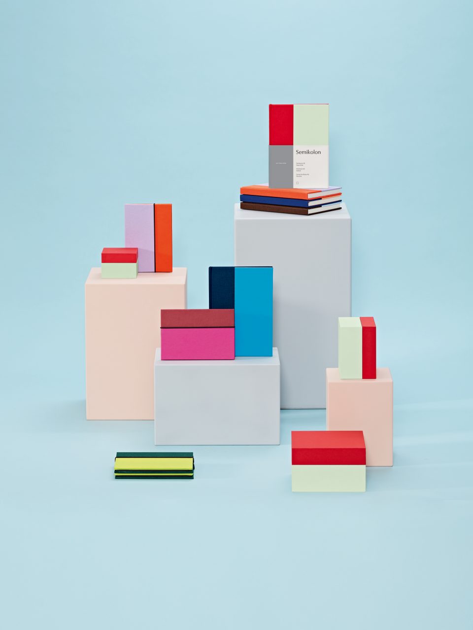
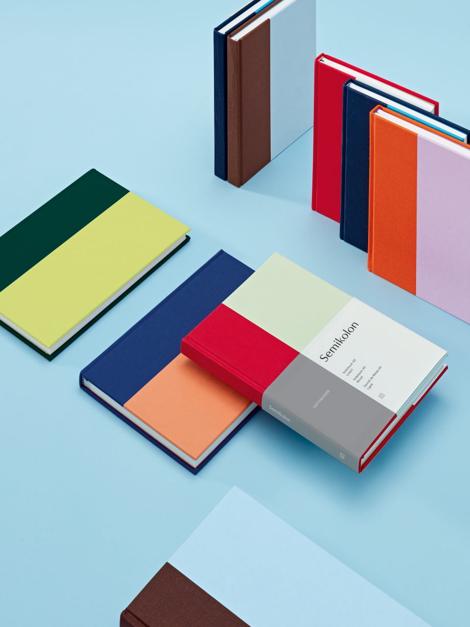
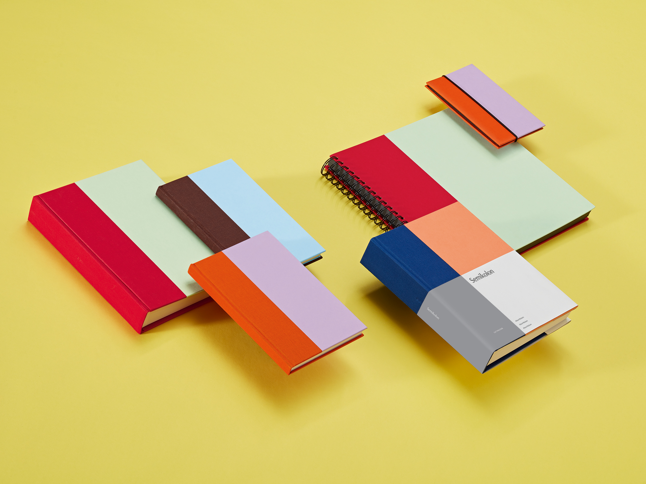
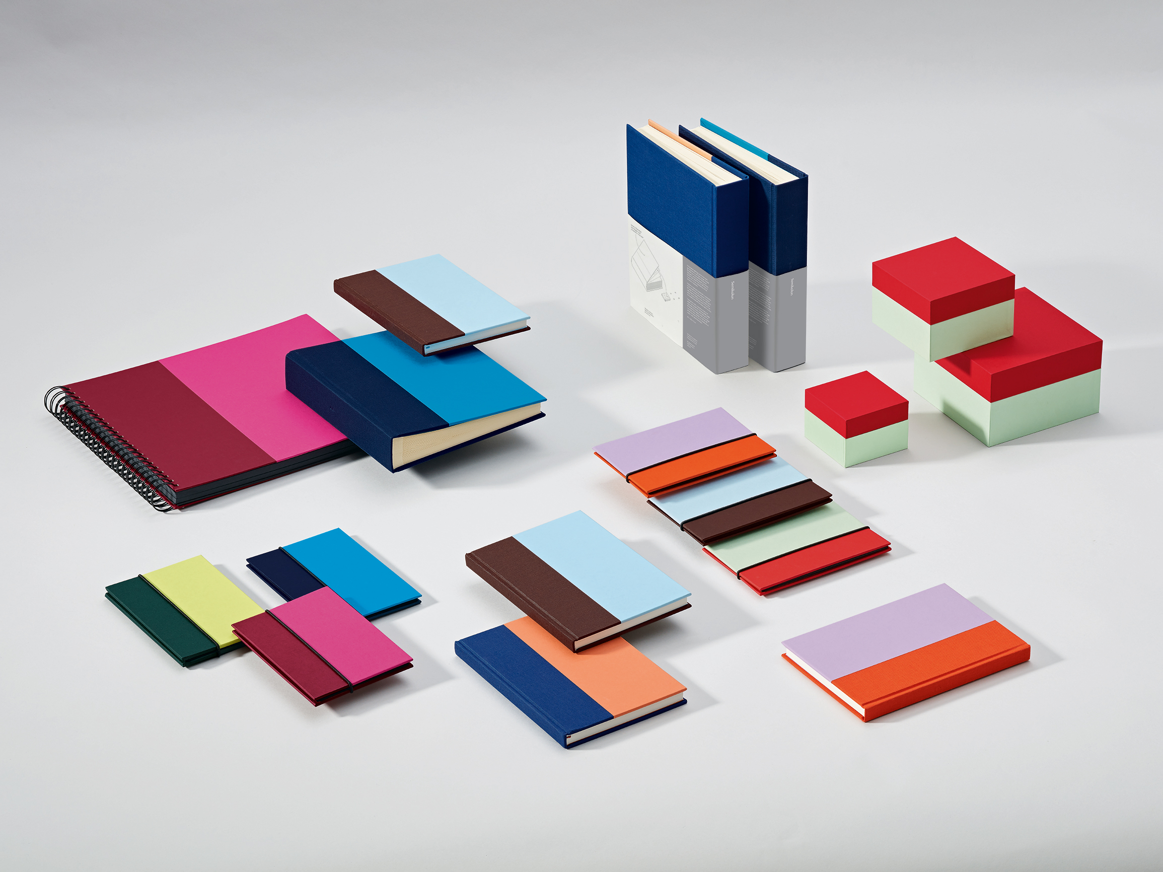
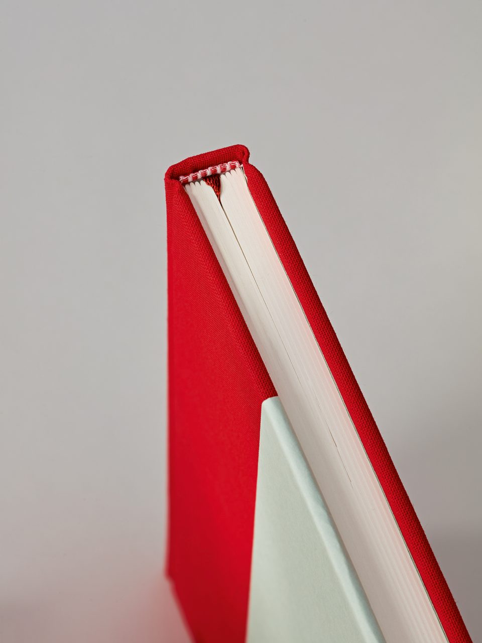
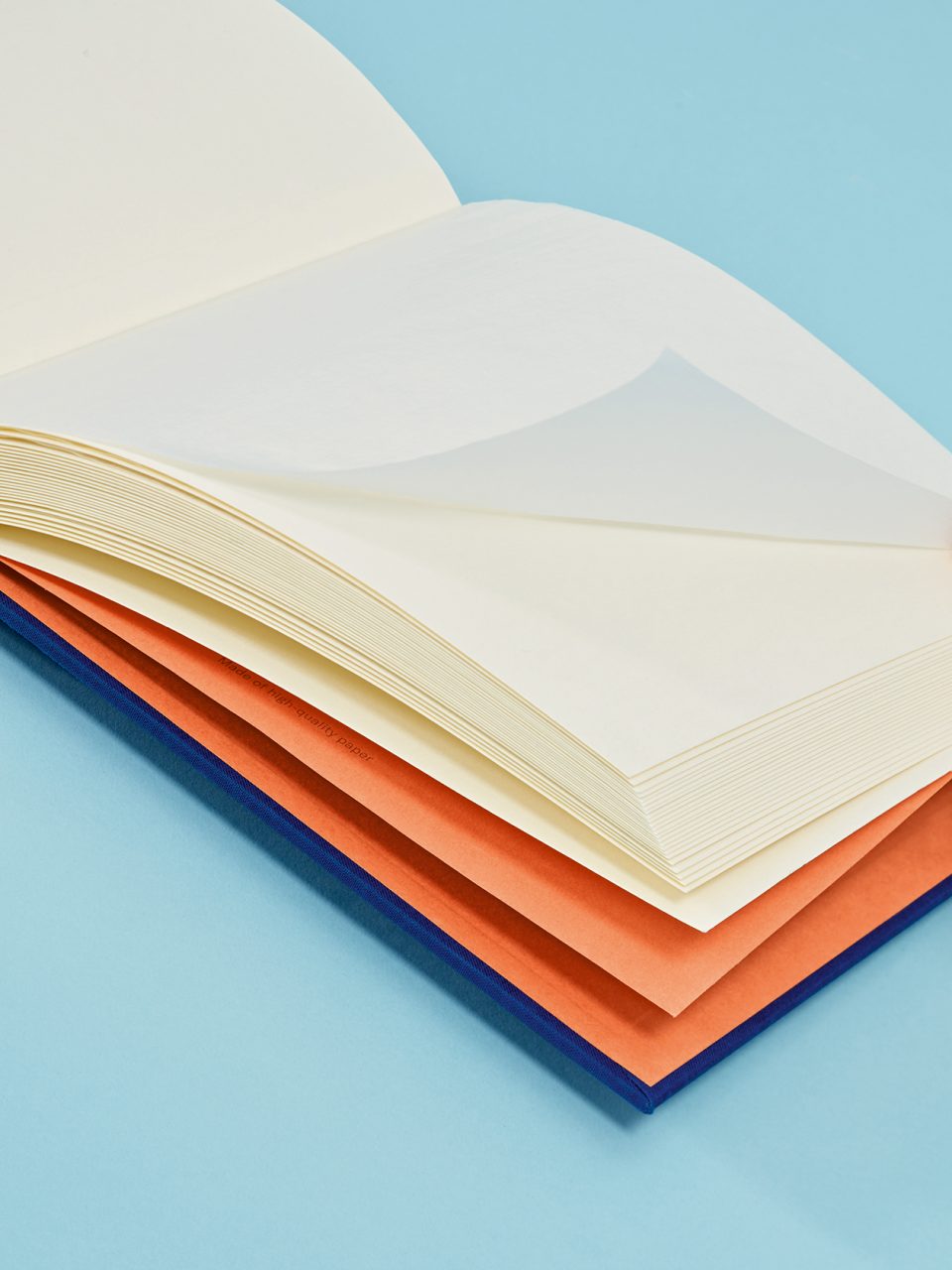
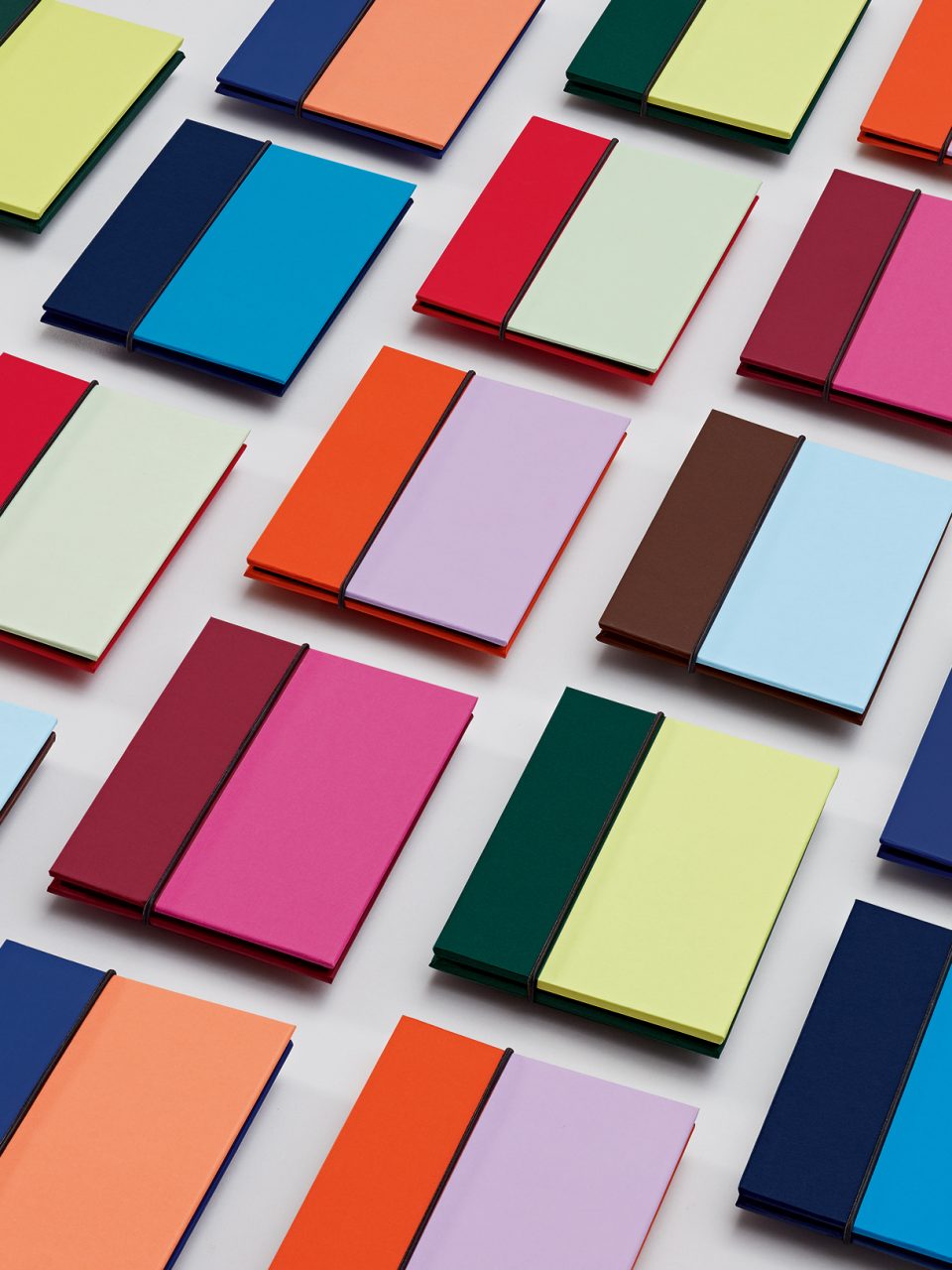
Based on the bookbinding practice of half-linen or half-leather binding, we developed a contemporary and sleek product line for the brand Semikolon over the last 2 years.
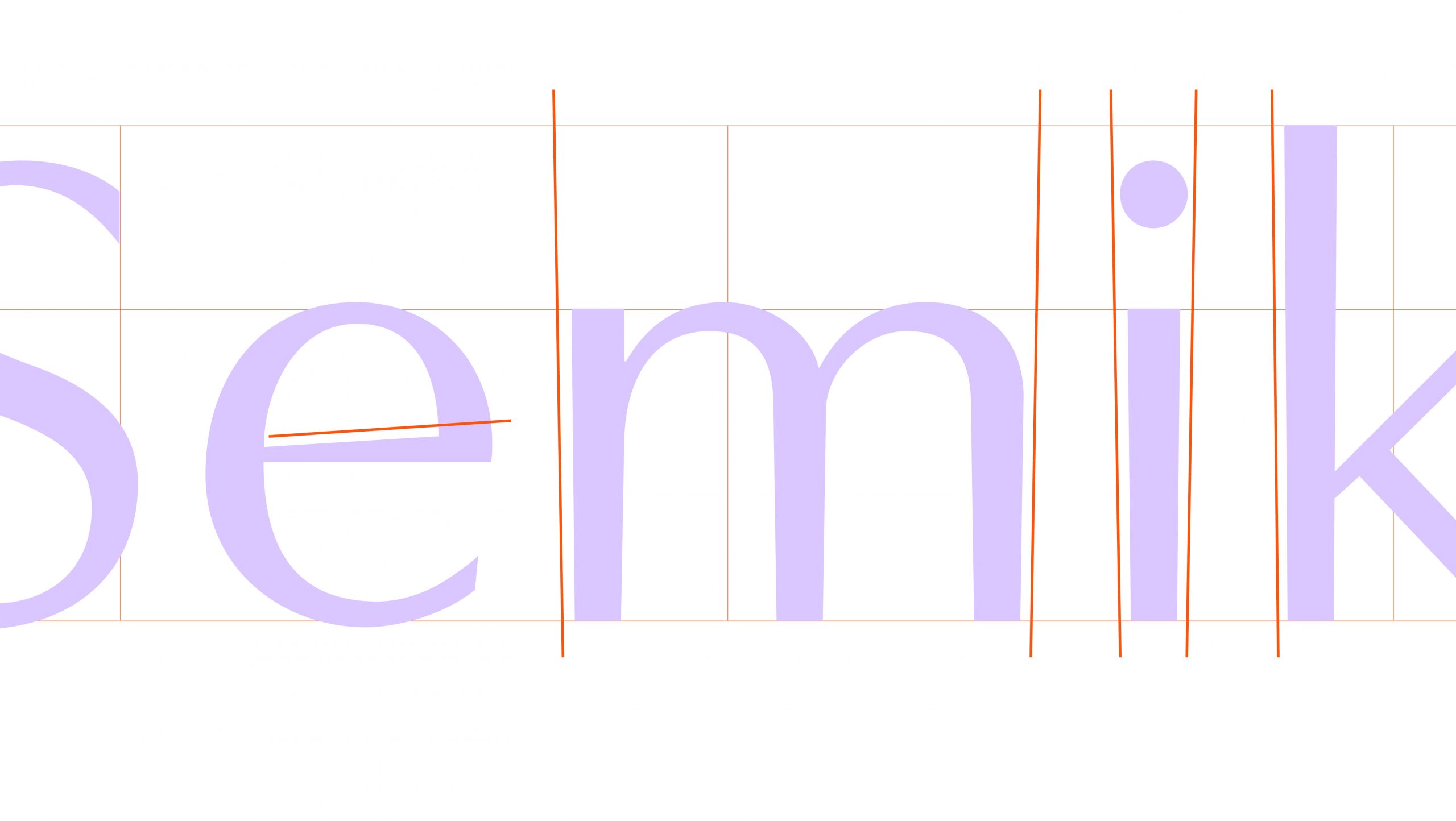
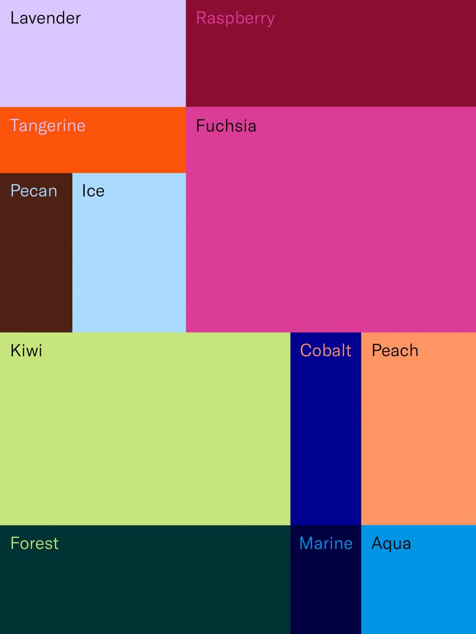
Divided in a “golden ratio” and wrapped in a fresh two-tone color scheme, it presents notebooks, photo albums and boxes for storing those things closest to your heart. Those things you want to keep. The word mark has been given an overhaul and underscores the quality of the products and what the brand represents. The monochrome linen products are now found in what we christened the “Heritage Line“, a nod to the real classics from Semikolon. Here, too, the colors have been refreshed. We set the typographic bracket for Semikolon with the font GT America, which we use in 2 cuts depending on the product line. Equipped with a new visual language we send this new baby out into the world with the words:
You are what you keep.
2021
Branding Corporate Logos Typography
Fotos: Semikolon
We use cookies to ensure that we give you the best experience on our website. If you continue to use this site we will assume that you are happy with it.AcceptRejectPrivacy policy