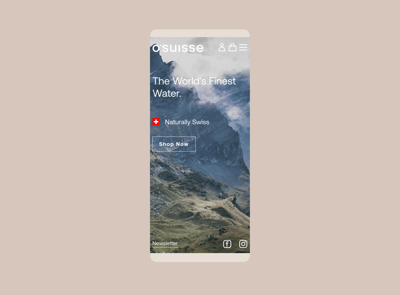
Water, one of Switzerland’s most treasured resources.
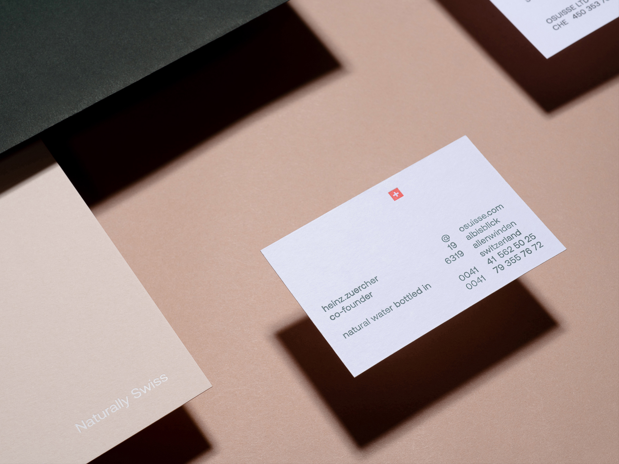
The red and white Swiss cross, one of the most recognizable national identification signs and seals of quality worldwide. Graphic and Product Design, an important tradition in Swiss culture and everyday life. All this can be summed up in one term: “Swiss-ness”.
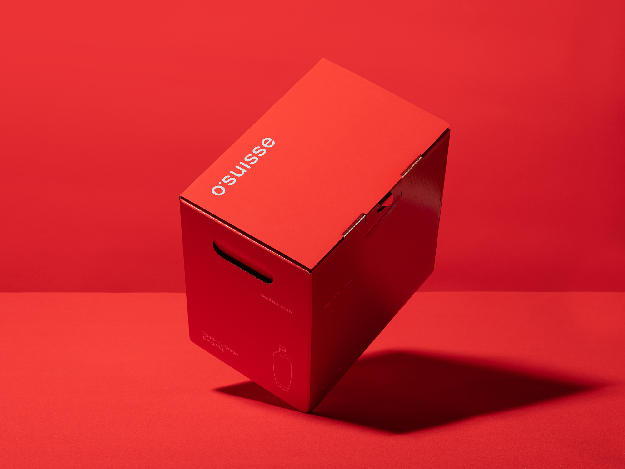
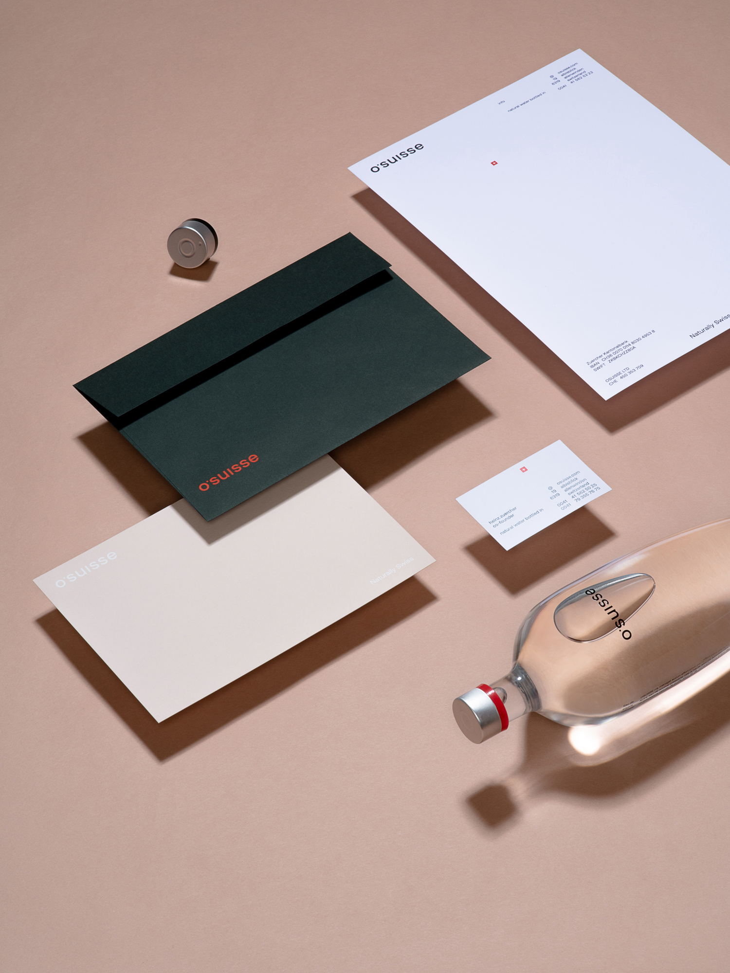
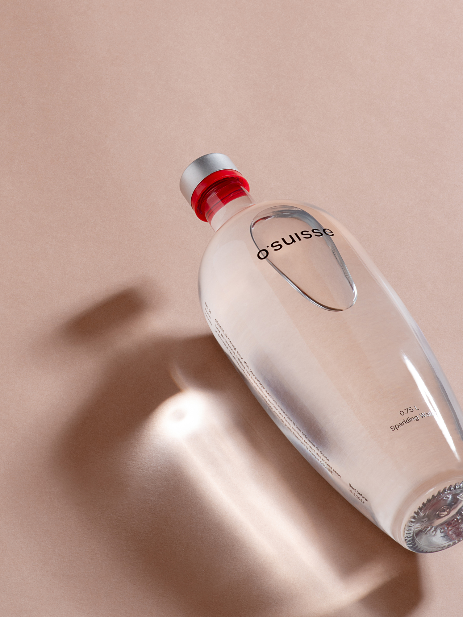
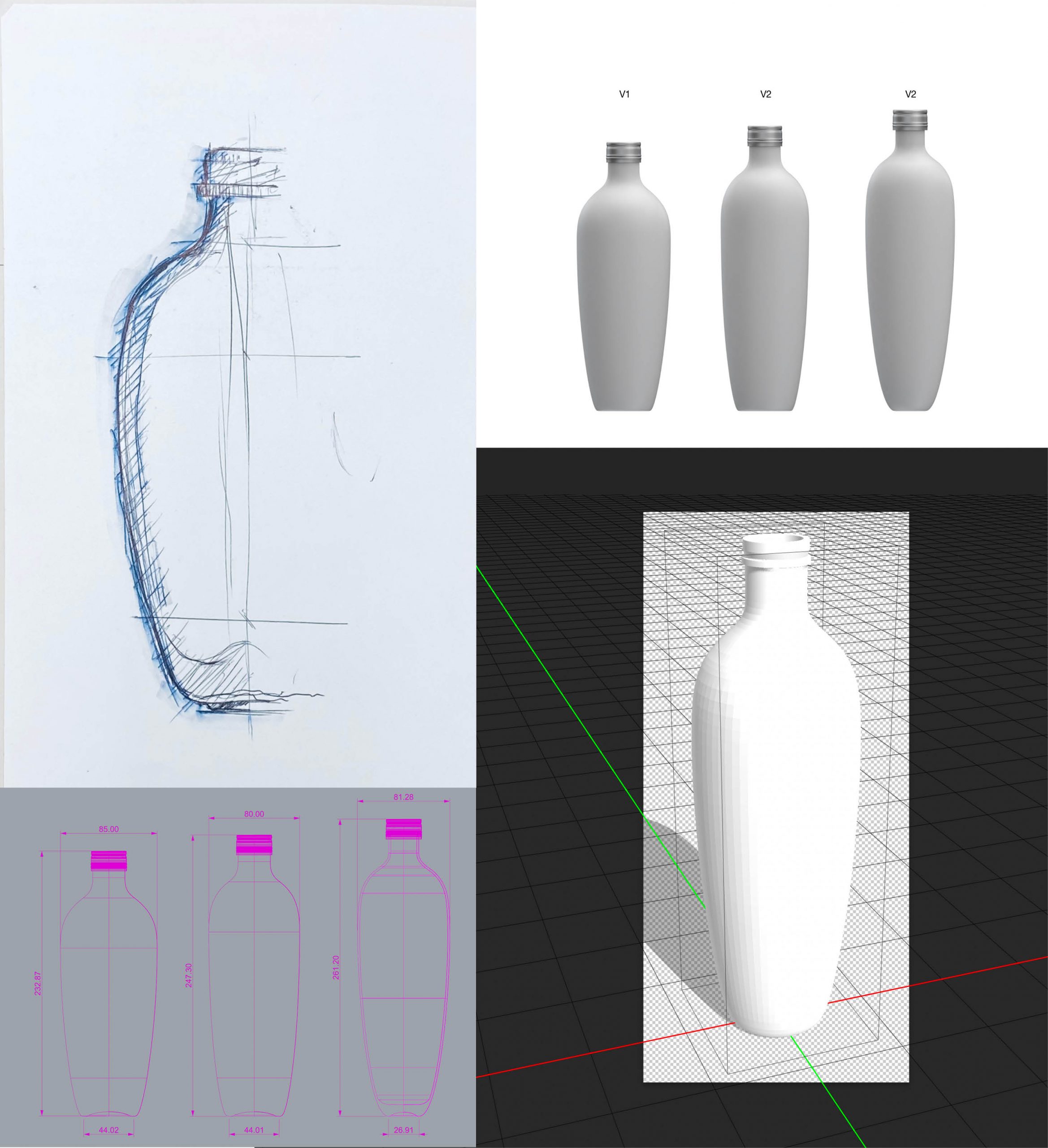
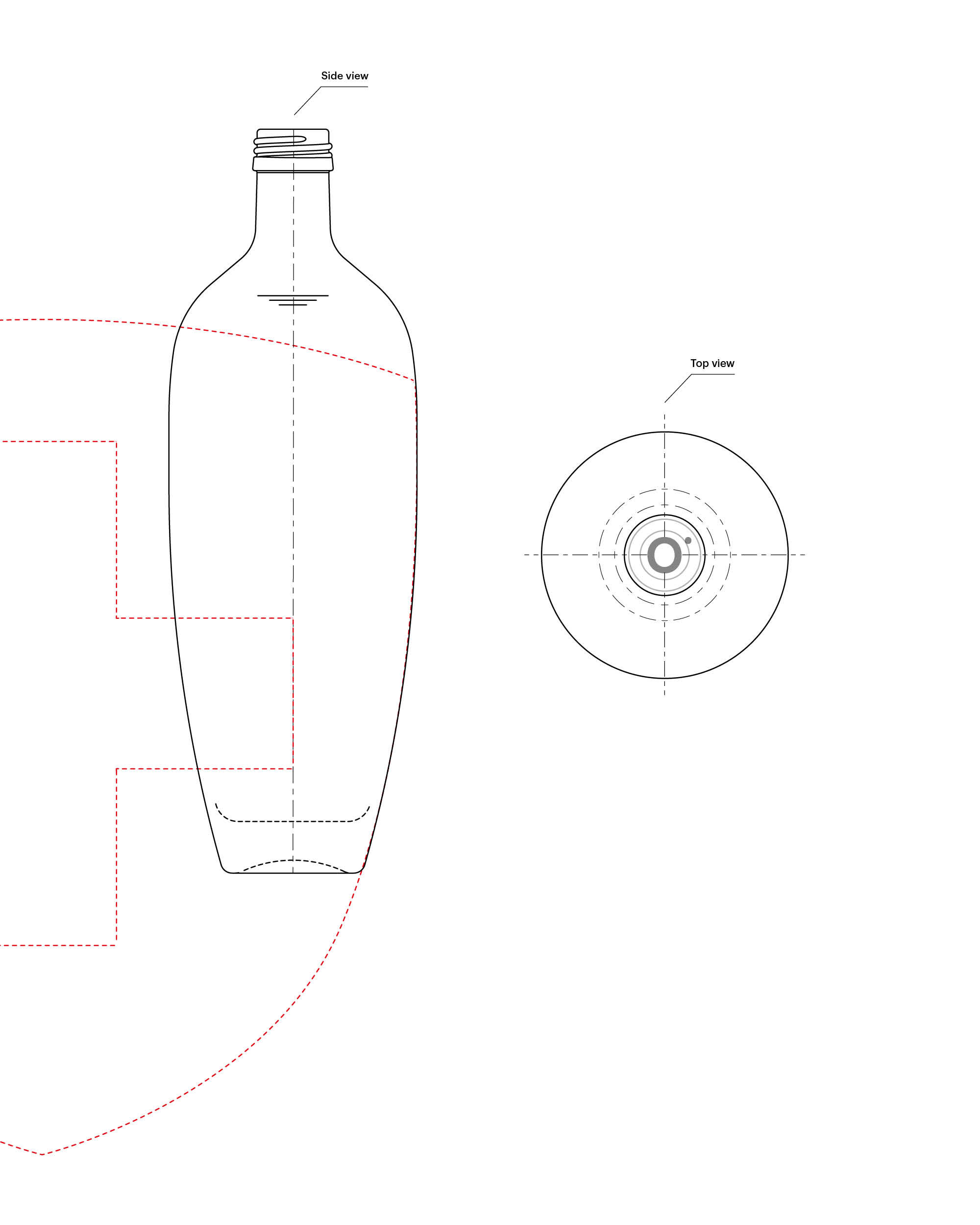
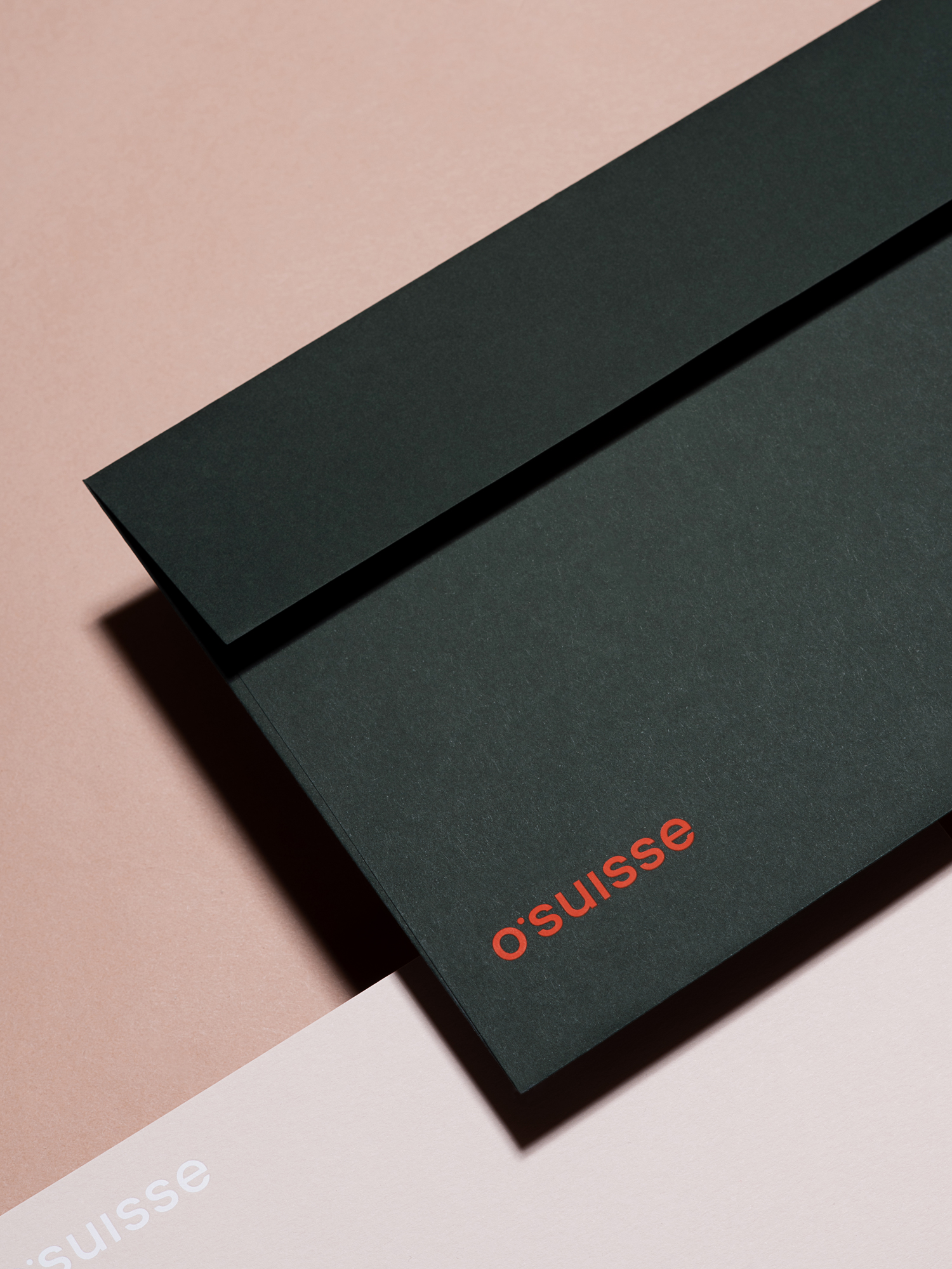
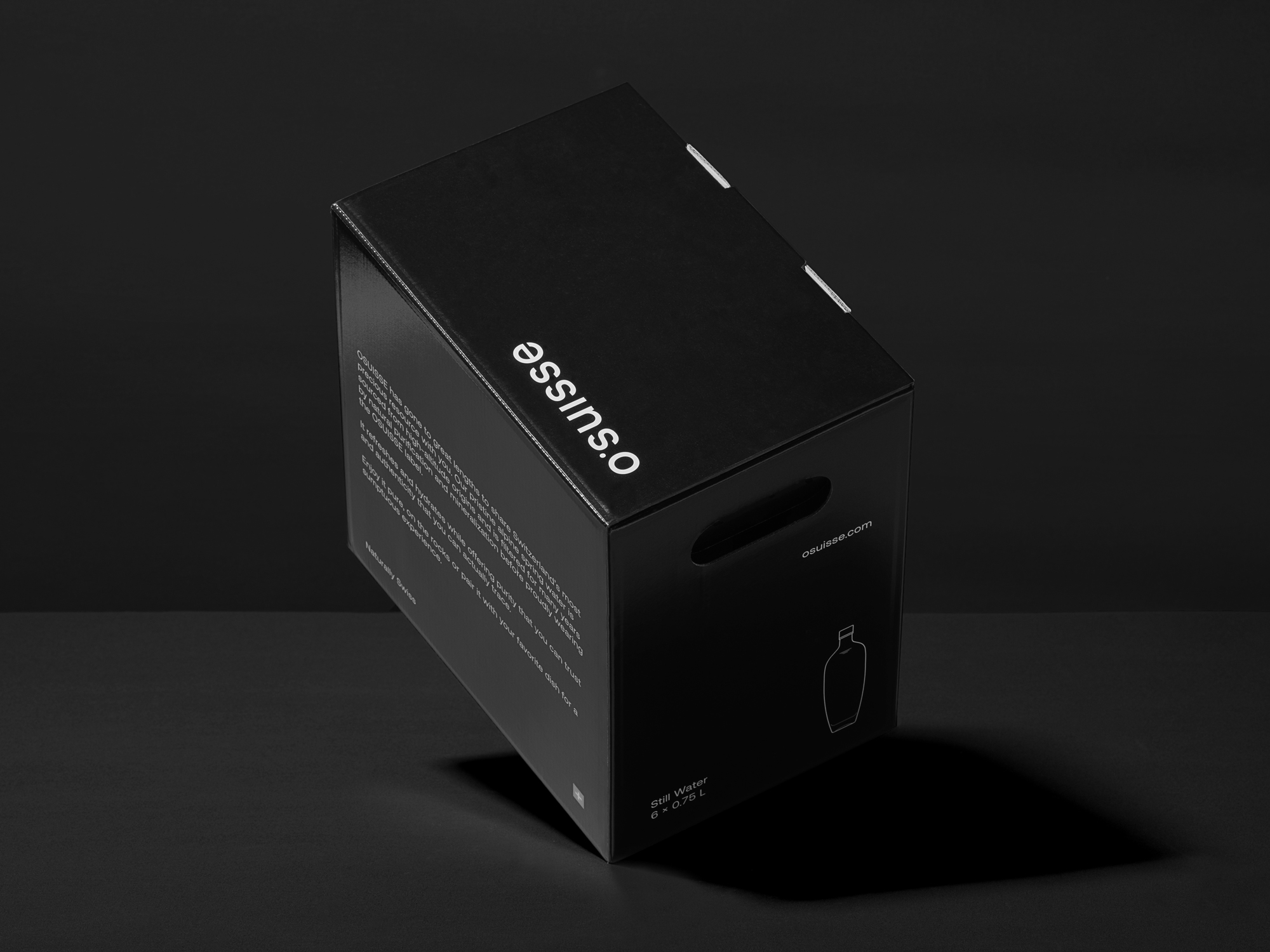
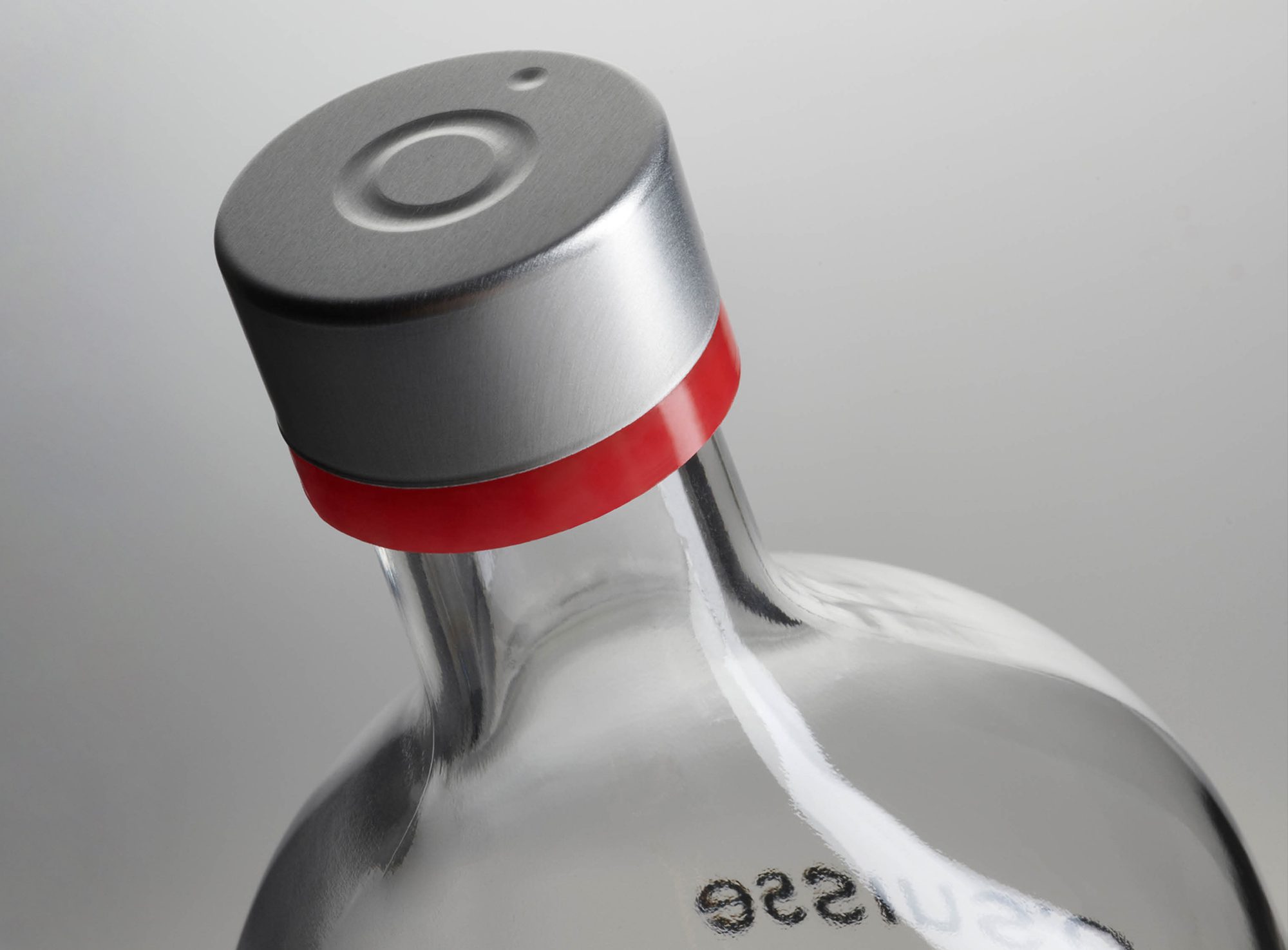
The unique opportunity to package these elements in a bottle and also to give it the perfect shape with an accompanying branding has been one of our most exciting tasks. The shape of the bottle takes its form from the Swiss coat of arms and becomes a design object on every table. The colours are ideally combined – dark green evoking the breathtaking nature found in Switzerland, red forever linked to the Swiss coat of arms.
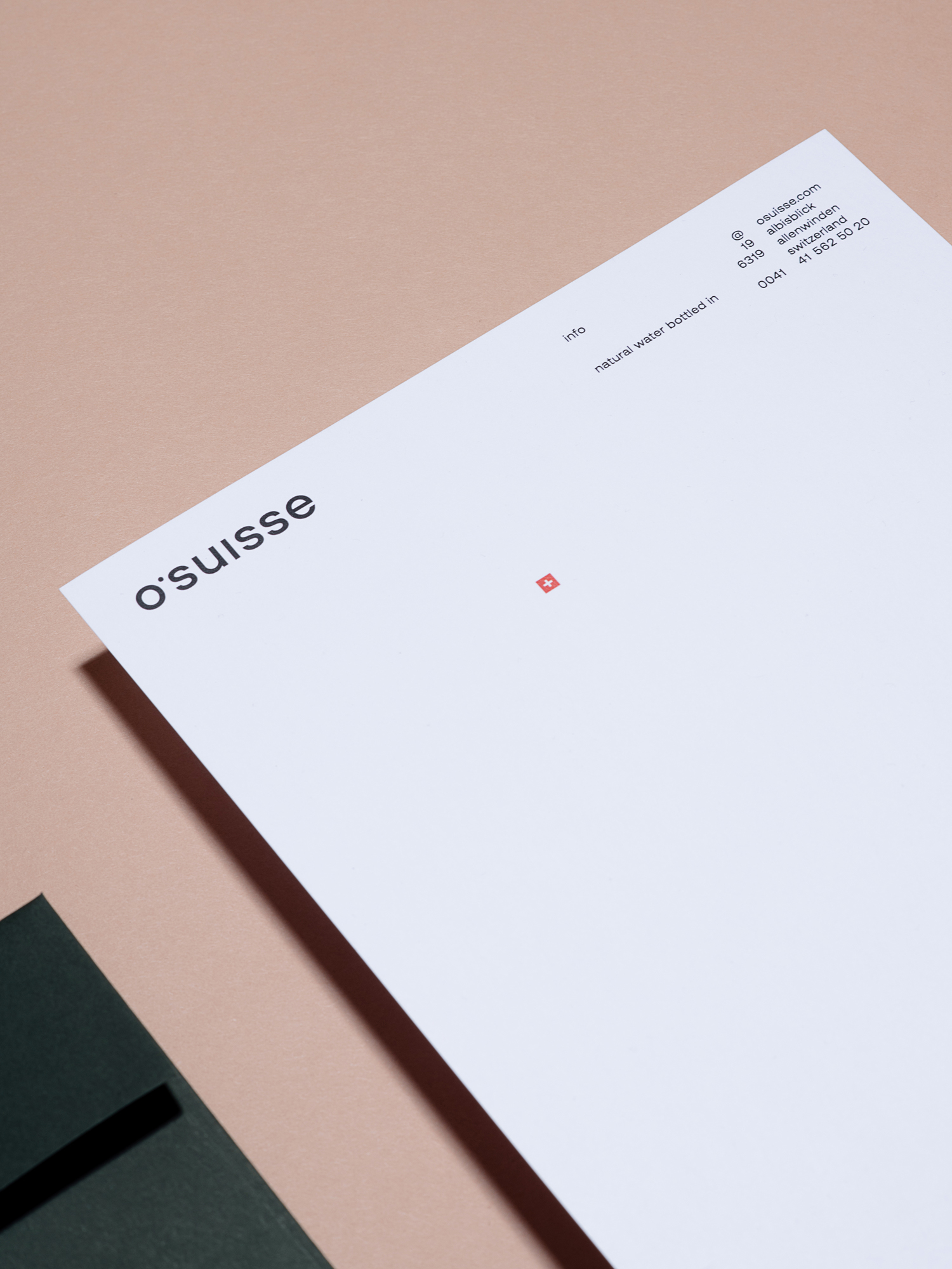
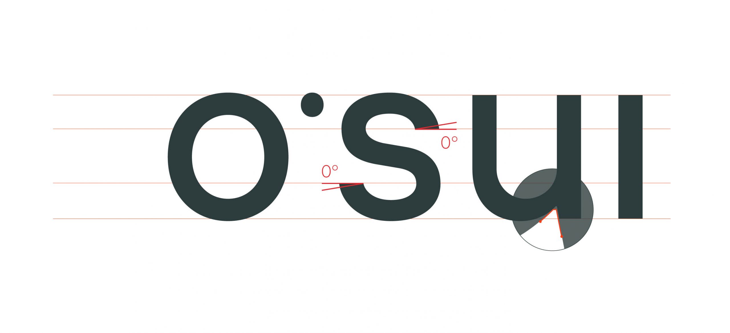
A clear typography – following a concrete grid – underlines the level of quality to be expected of the product. With sustainability in the choice of glass as a material, authenticity in the design and a certain savoir boire, we are happy to place this project on any table in the world. Cheers!