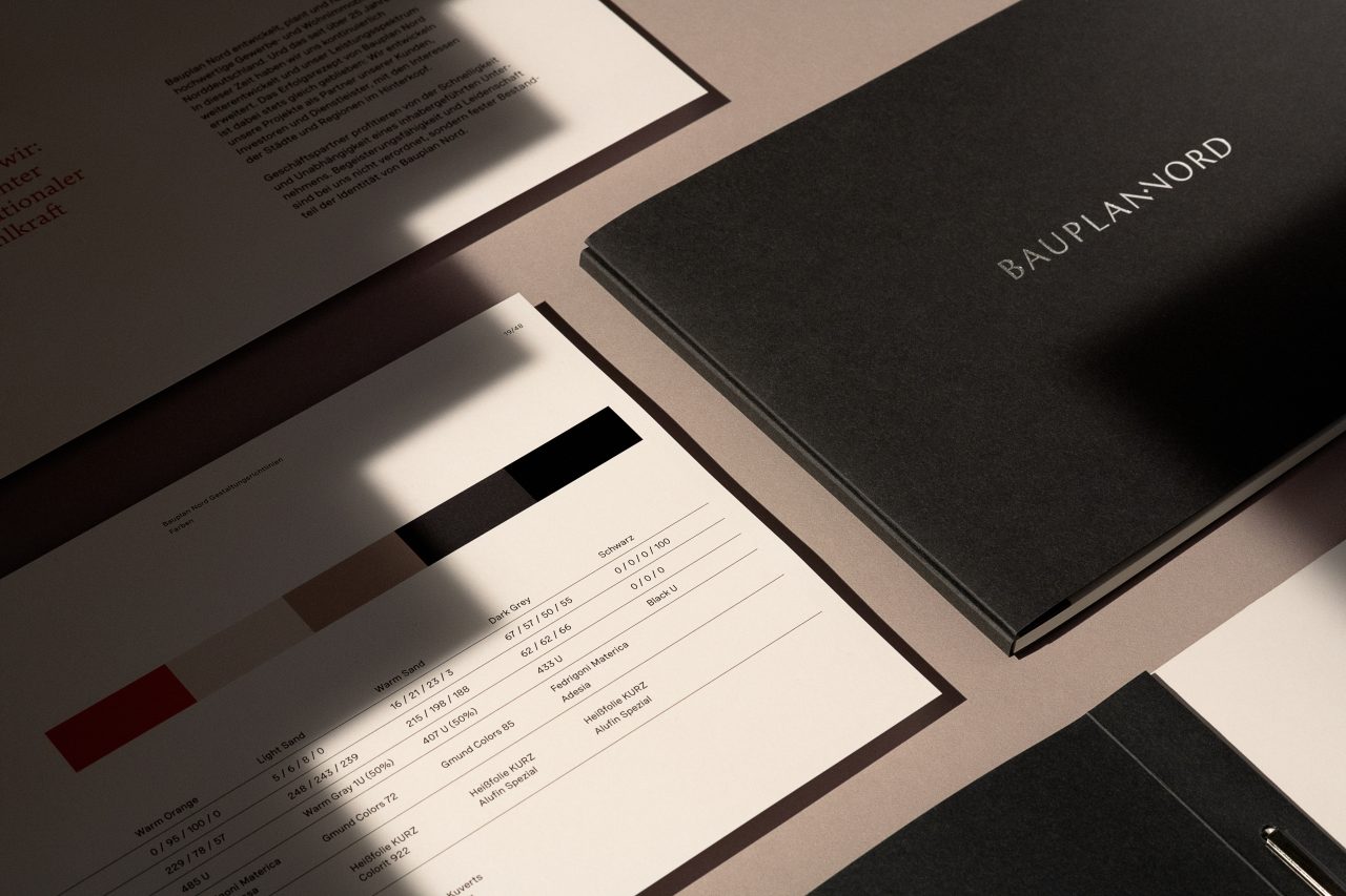
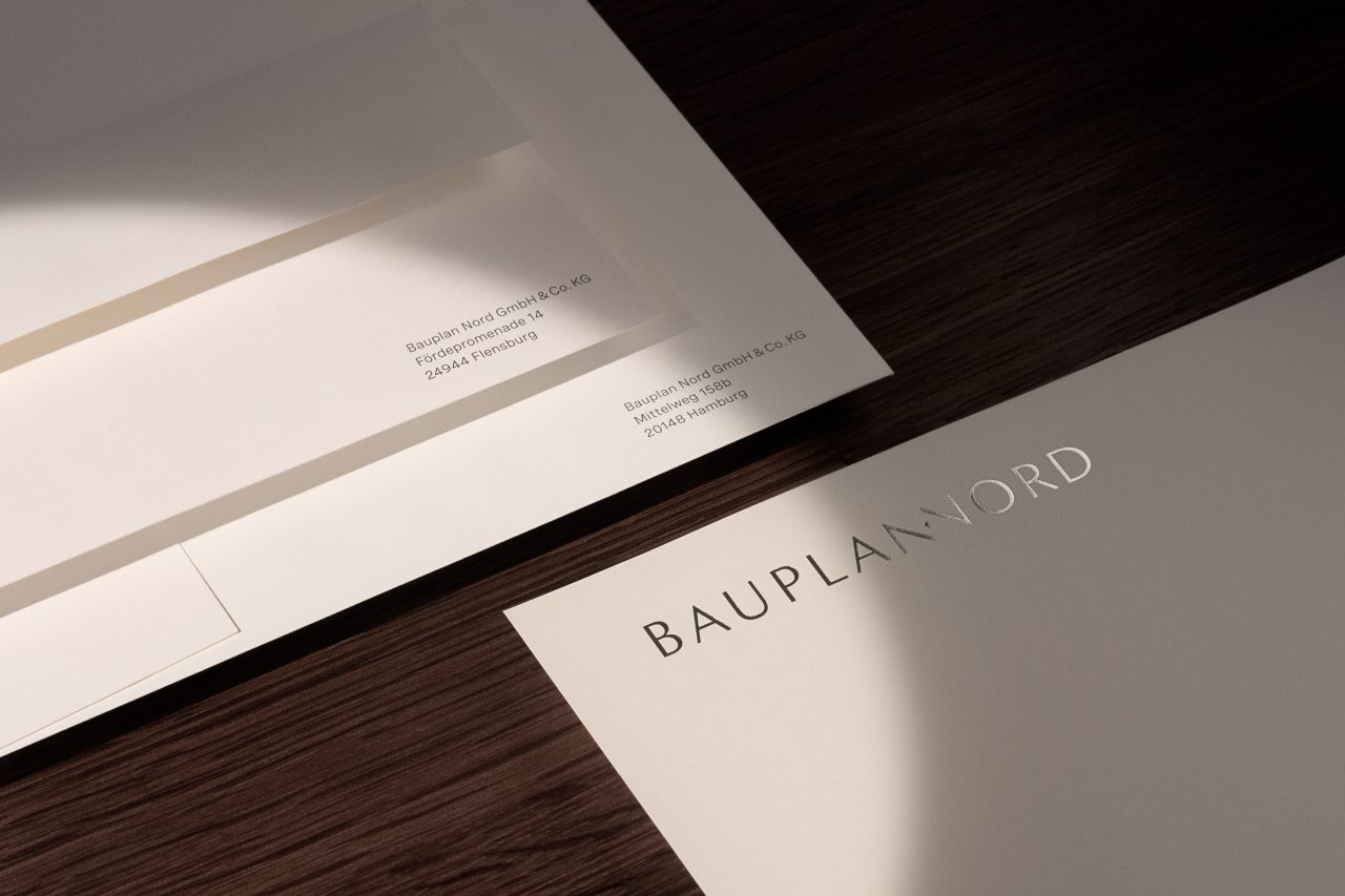
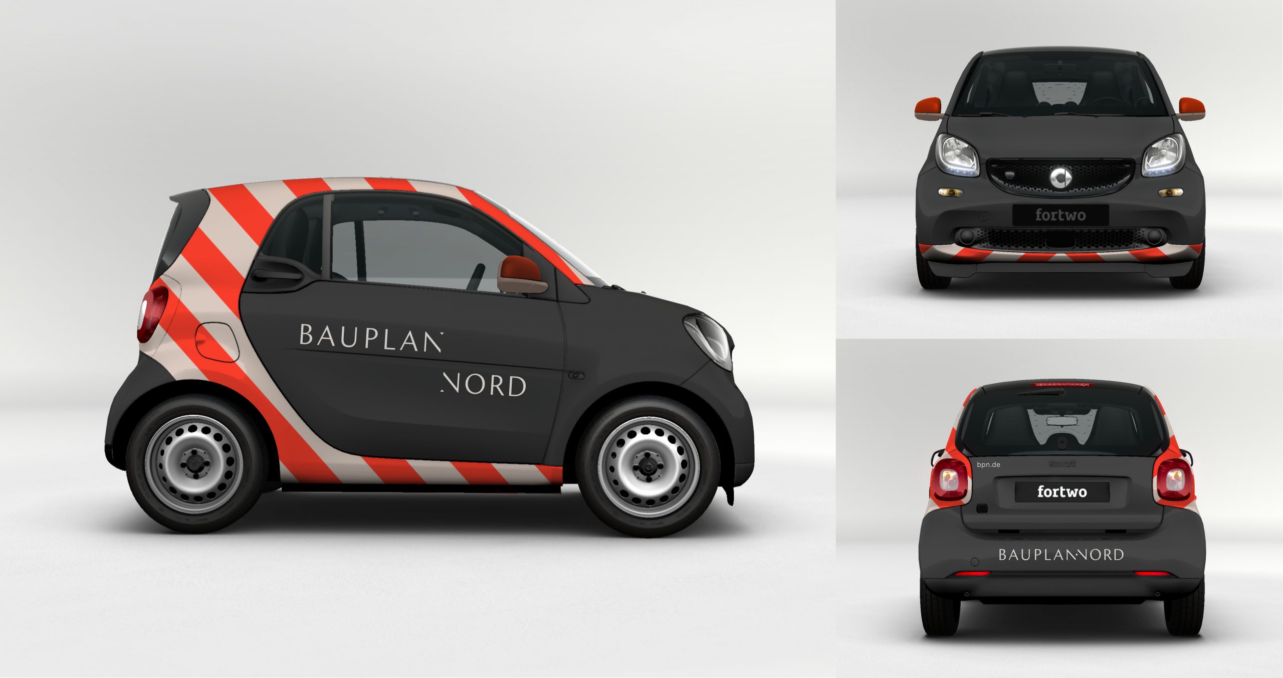
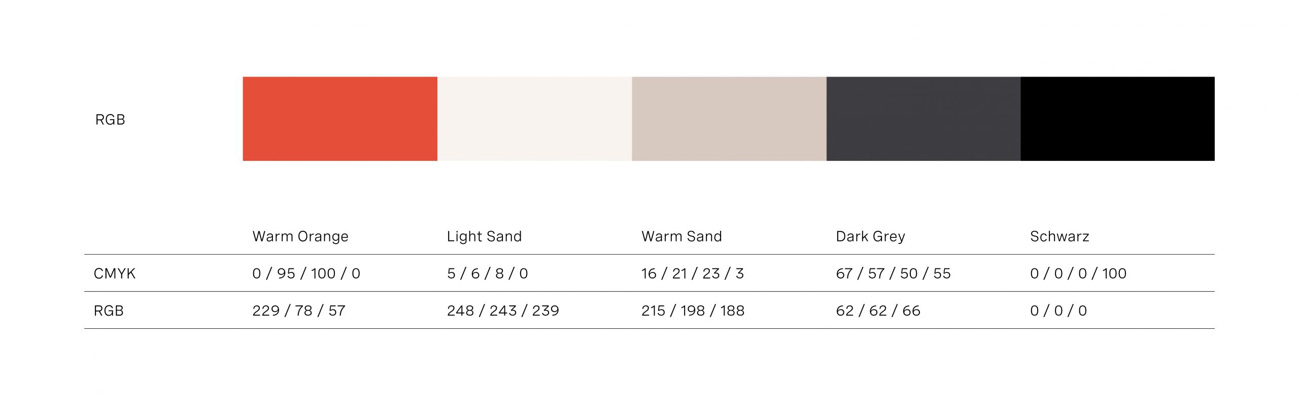
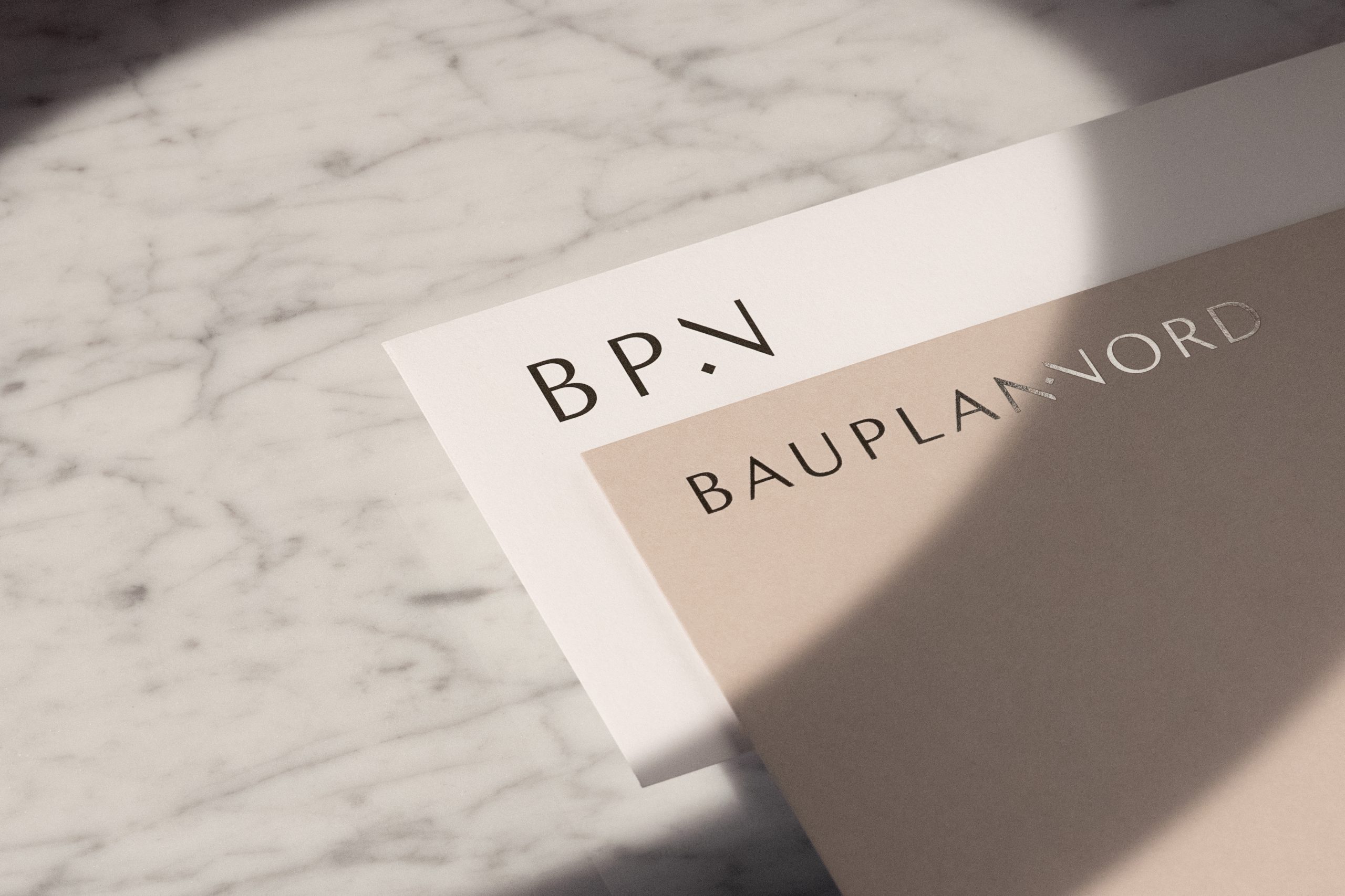
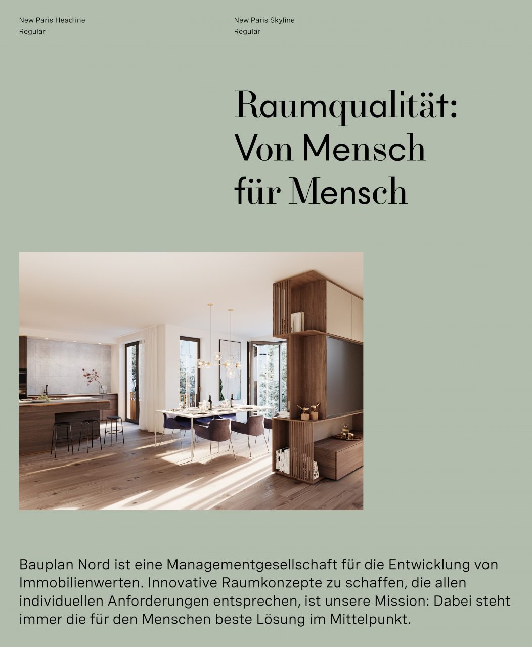
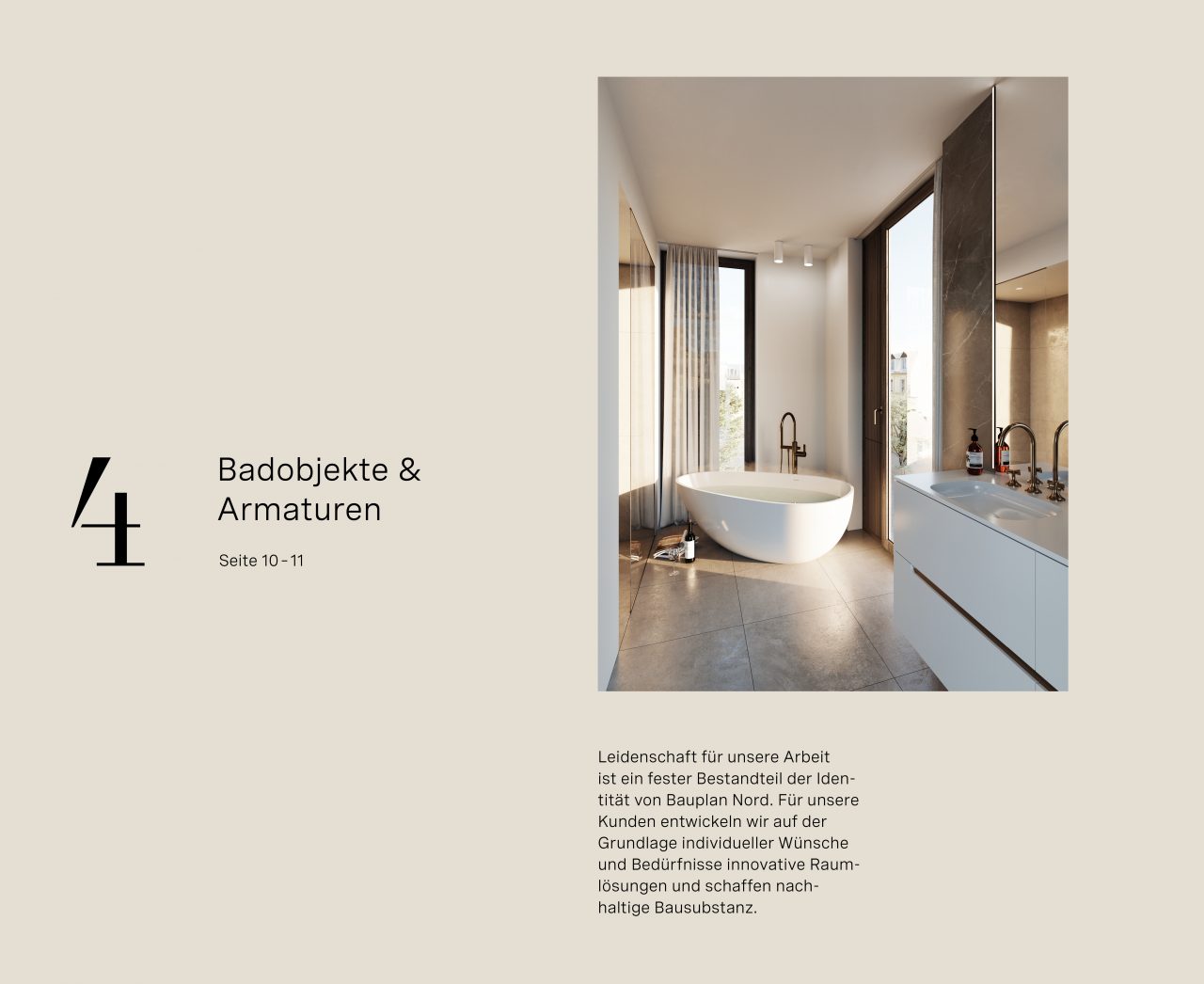
We don’t develop real estate, we develop your home – is the credo with which Bauplan Nord, founded in Flensburg over 20 years ago, has created a name for itself. We were tasked with designing an elegant and modern corporate identity to mark both the passing of the torch in this family business, as well as the expansion of their offices into Hamburg. The word mark was given the flexibility necessary for the demands of contemporary media, all the while maintaining a stability and high standard of quality reflective of the company. The new color scheme is cozy and inviting, complimented by the typography – a combination of Antiqua “FS Brabo” and Grotesque “Spezia”.
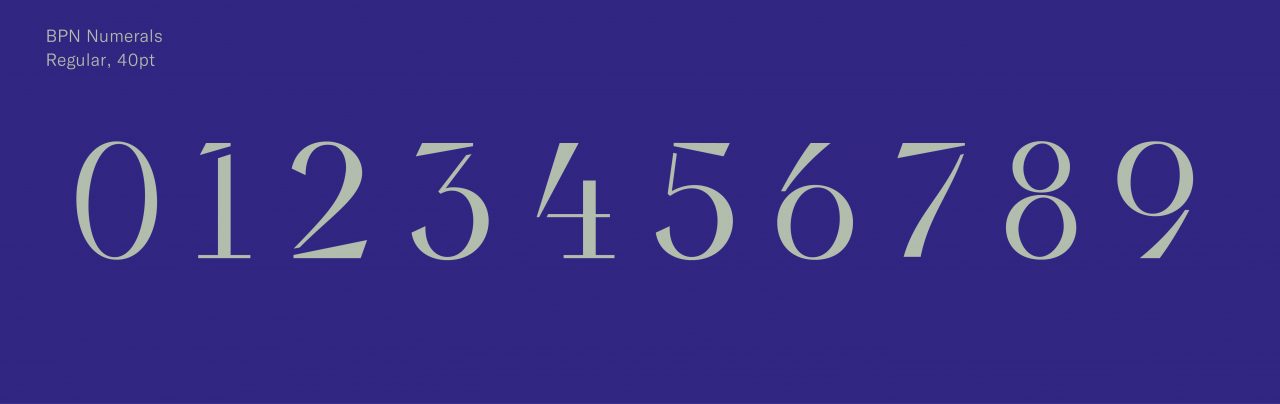
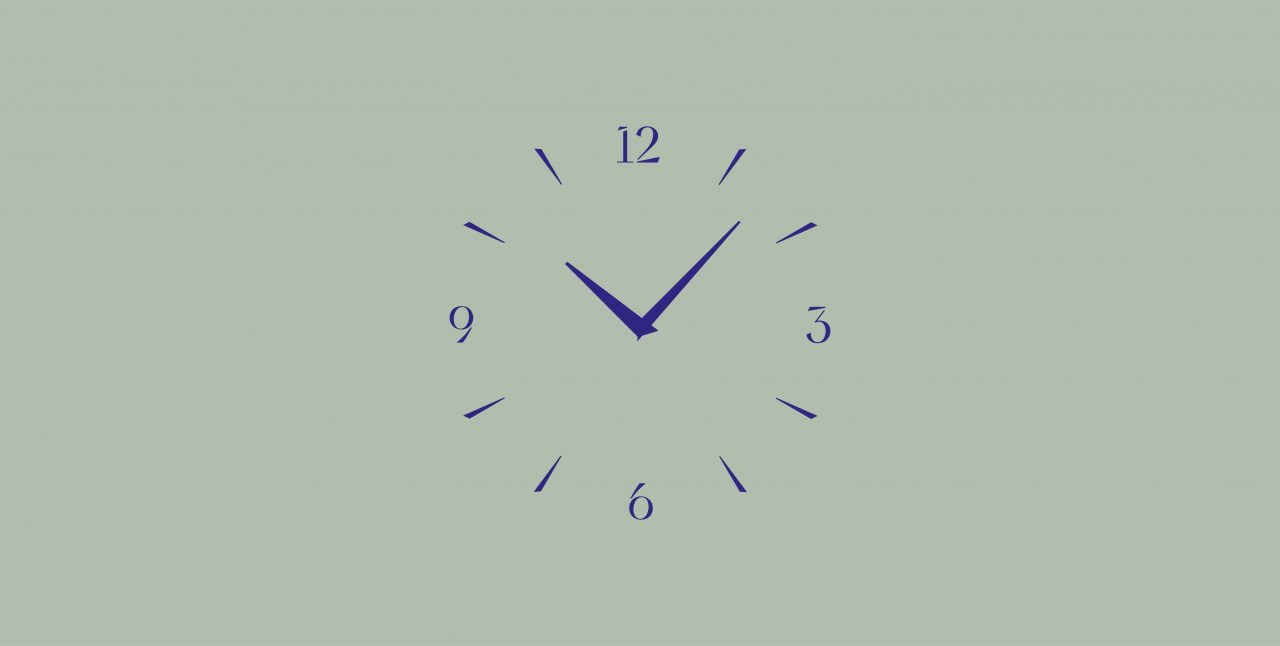
Each individual Bauplan Nord project is given its own unique corporate design, adapted to representing the object’s history and location. The idea of sustainability is reflected in the project Alte Rabenstrasse 3 in the use of the numbers we developed – first seen in the corporate design, and later on display on the property in form of an entranceway clock and the elevator lettering. The color scheme captures the property’s proximity to the Alster and central Hamburg location. The depth and attention to detail dedicated to the project is evident in visual elements such as the realistic and elaborate renderings.